In the competitive landscape of modern business, packaging serves as more than just a container—it's a silent salesperson that communicates directly with consumers. At the heart of this communication lies color psychology, a powerful tool that can influence purchasing decisions, shape brand perception, and foster emotional connections. This article explores how businesses can leverage color psychology in packaging box design to enhance brand recognition, drive sales, and create a lasting impression in the minds of their target audience. By dissecting the principles of color theory, real-world case studies, and practical applications, we'll uncover how strategic color choices can transform ordinary packaging into a compelling marketing asset.
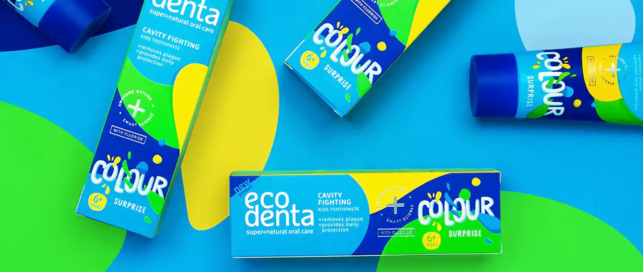
What Is Color Psychology in Packaging Box Design?
Color psychology in packaging refers to the study of how hues evoke emotional, cognitive, and behavioral responses in consumers. Every color carries a unique psychological weight: red may signal urgency or passion, blue could convey trust or calmness, and green often relates to nature or sustainability. For brands, this means selecting colors that align with their identity, product values, and target audience's preferences.
Consumers make subconscious judgments about products within seconds of seeing them, and color accounts for up to 85% of their purchase motivation (Kotler, 2023). For example, a food brand targeting health-conscious audiences might use green packaging to evoke freshness, while a luxury brand may opt for black or gold to signify exclusivity.
To illustrate, consider how Starbucks uses green in its packaging. The iconic emerald hue not only reflects the brand's commitment to ethically sourced coffee but also triggers feelings of relaxation and reliability, encouraging repeat purchases. On the flip side, energy drink brands like Red Bull rely on bold red and blue to communicate vitality and excitement, aligning with their product's intended effect.
| Color |
Primary Emotions |
Ideal Product Categories |
| Red | Urgency, Passion | Food, Retail Sales |
| Blue | Trust, Calmness | Tech, Finance, Healthcare |
| Green | Nature, Sustainability | Organic Products, Beauty |
| Yellow | Happiness, Energy | Children's Toys, Breakfast Foods |
| Purple | Luxury, Creativity | Beauty, Art Supplies |
How Do Colors Influence Consumer Perception in Packaging?
Colors act as a universal language, but their meanings can vary significantly across cultures and demographics. For instance, while white symbolizes purity in Western markets, it is associated with mourning in some Eastern cultures. This duality highlights the importance of researching target audiences before finalizing a color scheme.
A study by the Institute for Color Research found that 90% of initial product assessments are based on color alone. This is particularly evident in industries like cosmetics, where packaging colors often signal the product's purpose. A skincare line targeting anti-aging might use elegant silver or purple to convey sophistication, while a youthful brand may opt for vibrant pinks or oranges to attract younger buyers.
Cultural nuances also play a critical role. In China, red is a symbol of luck and prosperity, making it a popular choice for festive packaging. Conversely, in Western markets, red is frequently used to denote limited-time offers or clearance sales, leveraging its association with urgency. Brands like McDonald's adapt their packaging colors in different regions, using red and yellow globally to stimulate appetite but adjusting secondary hues to align with local preferences.
| Color |
Western Interpretation | Eastern Interpretation |
| Red | Passion, Danger | Luck, Celebration |
| White | Purity, Innocence | Mourning, Simplicity |
| Black | Elegance, Mystery | Power, Formality |
| Gold | Luxury, Wealth | Prosperity, Royalty |
Which Colors Work Best for Different Product Categories?
The ideal packaging color depends heavily on the product category and consumer expectations. Let's break down common industries and their color conventions:
Food & Beverage
Bright, appetizing colors like red, yellow, and orange are staples here. Red increases heart rate and stimulates hunger, which is why it's prevalent in fast food packaging (e.g., KFC). Yellow conveys happiness and warmth, making it suitable for breakfast cereals or snack brands. Green, as mentioned earlier, signals freshness and natural ingredients, ideal for organic products.
Luxury Goods
Luxury brands often rely on neutral or metallic tones to exude sophistication. Black, white, and gold are popular choices, as seen in Chanel and Rolex packaging. These colors evoke a sense of exclusivity and timelessness, appealing to consumers seeking premium experiences.
Tech Products
Blue and silver dominate tech packaging, reflecting trust, innovation, and modernity. Brands like Apple use sleek white packaging with subtle silver accents to emphasize minimalism and cutting-edge design. Meanwhile, gaming brands may incorporate bold reds or blacks to convey energy and performance.
A 2022 survey by Packaging Digest found that 63% of consumers believe packaging color directly influences their perception of product quality. This underscores the need for brands to align their color choices with category norms while still differentiating themselves from competitors.
What Are the Key Principles of Color Harmony in Packaging?
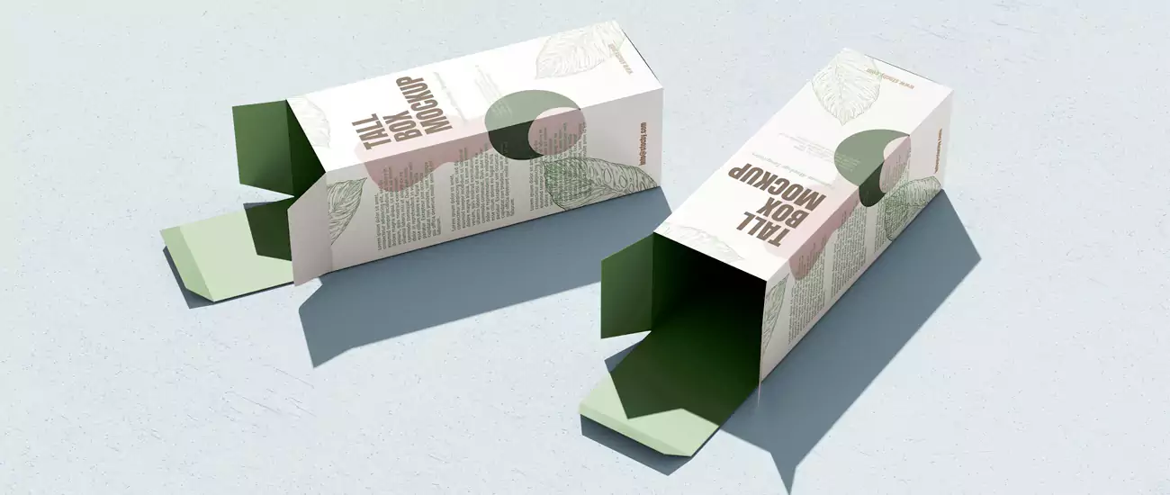
Creating a cohesive color scheme requires an understanding of color theory principles, such as contrast, balance, and harmony. A well-designed palette ensures that the packaging is visually appealing without overwhelming the consumer.
This is where it gets interesting…
Contrast is essential for drawing attention to key elements, such as the brand logo or product name. For example, a dark background with a bright white logo creates a strong visual hierarchy, making the brand instantly recognizable. Monochromatic schemes, which use different shades of a single color, can evoke elegance and simplicity, as seen in Lush Cosmetics packaging, which often uses varying tones of green.
Complementary colors, located opposite each other on the color wheel (e.g., blue and orange), create vibrant, high-energy combinations. This approach is effective for brands aiming to stand out on crowded shelves, such as Fanta with its orange and blue packaging. However, overusing complementary colors can lead to visual clutter, so balance is key.
A common mistake is neglecting the background color's impact. Light colors like white or cream can make packaging feel airy and clean, while dark colors like black or navy add a sense of luxury. For instance, Kiehl's uses a crisp white background for its skincare packaging, emphasizing simplicity and purity.
How to Align Packaging Colors with Brand Identity?
Consistency is crucial for building brand recognition. Packaging colors should mirror the brand's visual identity, including logos, websites, and marketing materials. For example, Coca-Cola's iconic red packaging is instantly recognizable worldwide, reinforcing its brand personality as energetic and timeless.
But here's the catch…
Brands must also consider their target audience's demographics. A brand targeting millennials might use trendy pastels or bold neons, while a brand focused on baby boomers may prefer classic, muted tones. Dove, for instance, uses soft pinks and purples in its packaging to align with its message of gentle care and femininity.
Case studies highlight the impact of color consistency. Amazon's orange packaging, featuring the brand's signature smile logo, creates a cohesive experience from delivery to unboxing. This consistency has helped Amazon become one of the most recognizable brands globally, with consumers associating its orange color with reliability and speed.
Can Color Psychology Increase Sales? Real-World Examples
Numerous studies and case studies confirm the direct link between color psychology and sales. One notable example is Cadbury, which shifted its chocolate packaging from brown to purple in the 1990s. The move not only differentiated the brand from competitors but also created a stronger emotional connection with consumers, leading to a significant sales uplift.
A study by HubSpot found that 85% of consumers cited color as the primary reason for purchasing a product. For Brand X, a hypothetical snack company, changing its packaging from dull brown to vibrant yellow and orange resulted in a 15% increase in sales within three months. The new colors communicated freshness and energy, appealing to younger demographics.
Another example is Slack, whose bright green packaging and branding signal productivity and positivity. The color choice aligns with the company’s mission to simplify workplace communication, and it has become a key factor in its rapid brand recognition.
What Mistakes Should Designers Avoid in Color Selection?
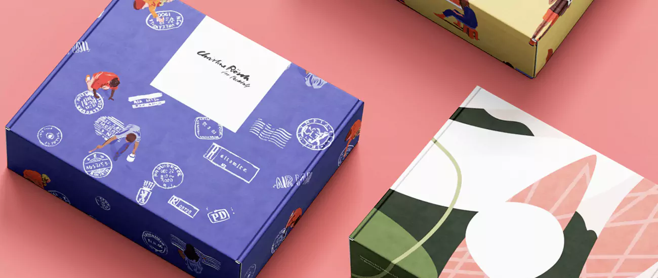
While color psychology offers powerful benefits, missteps can undermine a brand's message. One common mistake is ignoring the target audience's preferences. For example, a senior-focused health supplement using neon colors might fail to resonate, as older demographics often prefer more subdued tones.
Another pitfall is overusing trends. While millennial pink was popular in the 2010s, brands that relied solely on this trend risked becoming obsolete as tastes evolved. Sustainability-focused brands that jumped on the green bandwagon without genuine eco-friendly practices also faced backlash, highlighting the importance of authenticity.
Additionally, cultural insensitivity can lead to costly errors. A brand using white packaging in Japan for a celebratory product might inadvertently convey mourning, alienating consumers. Thorough research into regional color meanings is essential for global brands.
How to Test Color Effectiveness in Packaging?
Before launching a new packaging design, brands should conduct rigorous testing to ensure their color choices resonate with the target audience. A/B testing is a popular method, where two different color schemes are tested with separate consumer groups to measure engagement, click-through rates, or sales.
This is where data drives decisions…
For example, a cosmetics brand might test a pink vs. purple packaging design for a new lipstick line. By analyzing which variant generates more online purchases, the brand can make an informed decision about the final design.
Eye-tracking studies provide deeper insights by measuring where consumers look first on a package. Brands can use this data to optimize color placement, ensuring key elements like the brand name or product benefits stand out. A 2021 study by Tobii Pro found that consumers spend 30% more time looking at packaging with high-contrast color schemes.
Another effective method is focus groups, where consumers provide qualitative feedback on packaging designs. This can uncover emotional reactions that quantitative data might miss, such as whether a color feels “dated” or “innovative.”
What Role Do Neutrals (Black, White, Gray) Play in Packaging?
Neutral colors are often overlooked but serve as essential foundations in packaging design. White is synonymous with purity and simplicity, making it a popular choice for skincare and wellness brands. La Roche-Posay, for example, uses white packaging to convey clinical effectiveness and cleanliness.
Black exudes luxury and sophistication, ideal for high-end products. Tom Ford Beauty relies on sleek black packaging to communicate exclusivity, while Samsung uses black in its tech packaging to emphasize modernity.
Gray strikes a balance between warmth and neutrality, making it suitable for brands aiming for understated elegance. Microsoft’s Surface line uses gray packaging to reflect professionalism and reliability, appealing to business audiences.
Neutrals also excel at making accent colors pop. A white background with a bold red logo creates instant visual contrast, as seen in Target’s iconic red bullseye on a white backdrop. Similarly, gray can tone down overly vibrant palettes, ensuring the design feels balanced rather than chaotic.
How to Use Color Psychology for Sustainable Packaging Messaging?
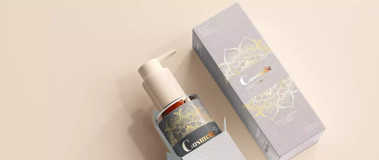
As sustainability becomes a key consumer priority, packaging colors that communicate eco-friendliness are gaining traction. Green remains the go-to hue for environmental messages, as it naturally connects with nature and sustainability. Brands like Patagonia use earthy greens in their packaging to reinforce their commitment to the planet.
Brown, derived from natural materials like kraft paper, is another popular choice for sustainable brands. Whole Foods Market uses brown packaging for its bulk products, signaling simplicity and minimal environmental impact. Additionally, tan and beige can evoke a rustic, artisanal feel, suitable for brands emphasizing organic or handmade products.
But sustainability isn't just about green…
Brands can also use blue to convey water conservation or cleanliness, as seen in Nestlé's Pure Life water packaging. Yellow, when paired with green, can highlight recycling efforts or energy efficiency, creating a cheerful yet impactful message.
What Tools Help Create Effective Color Palettes for Packaging?
Designers no longer have to rely on guesswork to create harmonious color schemes. Digital tools like Adobe Color allow users to generate palettes from images or using color theory rules, such as monochromatic or triadic schemes. This tool is ideal for brands looking to match their packaging colors to product photography or brand imagery.
Pantone Color Finder is another essential tool, particularly for print packaging. It provides industry-standard color codes, ensuring consistency across different printing processes. Brands like Pantone itself use this tool to define trend colors, such as the annual “Color of the Year,” which influences packaging designs worldwide.
For those seeking AI-driven solutions, Coolors offers a seamless palette generator with real-time previews. Designers can lock specific colors (like a brand's primary hue) and generate complementary shades with a click, streamlining the design process.
The Canva Color Wheel is a user-friendly option for non-designers, allowing them to experiment with color combinations and receive instant feedback on harmony and contrast. This tool is perfect for small businesses or startups creating packaging in-house.
How Does Color Psychology Vary Across Global Markets?
Global brands must adapt their packaging colors to reflect regional cultural norms. In Western markets, pink is often associated with femininity and youth, but in Japan, it symbolizes good fortune. This difference highlights the need for localized color strategies.
In India, yellow is linked to happiness and knowledge, making it a popular choice for educational products. Conversely, in Greece, yellow is associated with mourning, requiring brands to adjust their palettes accordingly.
Brands like Unilever excel at global color adaptation. For example, its Lipton Tea packaging uses yellow in Western countries to signal freshness but switches to red in some Asian markets to align with cultural preferences for warmth and celebration.
Can Packaging Colors Evoke Nostalgia?
Nostalgia is a powerful marketing tool, and color plays a significant role in triggering emotional memories. Brands often use retro color palettes to transport consumers back to past eras. For example, Fanta's recent “Throwback” packaging used 1980s-inspired neon oranges and greens to appeal to millennials nostalgic for childhood snacks.
Crayola leverages nostalgia by incorporating vibrant, nostalgic hues in its packaging, reminding adults of their creative childhoods. The brand's iconic yellow and green color scheme has remained consistent for decades, creating a strong emotional connection with multiple generations.
But nostalgia isn't limited to bright colors. Minimalist brands like Muji use muted, retro-inspired tones to evoke a sense of simplicity and timelessness, appealing to consumers seeking to escape modern complexity.
What Future Trends in Color Psychology for Packaging?
As consumer preferences evolve, so too will color trends in packaging. One emerging trend is AI-driven color palettes, where algorithms analyze consumer data to predict which colors will resonate with specific demographics. Brands like Nike are already using AI to customize packaging colors for regional markets, ensuring maximum relevance.
Another trend is monochromatic gradients, which add depth and visual interest to minimalist designs. Apple has embraced this approach in recent product packaging, using subtle silver gradients to convey modernity without overwhelming the consumer.
Sustainability will also influence color choices, with brands increasingly using dusty greens and terracotta browns to reflect earthy, eco-friendly values. These tones align with the growing demand for natural and organic products.
Step-by-Step Guide: Applying Color Psychology to Packaging Design
1. Research Your Audience and Brand
Start by defining your target audience's demographics, cultural background, and preferences. Identify your brand's core values and personality—are you playful, luxurious, or eco-conscious?
2. Select Core and Accent Colors
Choose 1–2 primary colors that align with your brand message (e.g., blue for trust) and 1–2 accent colors to add visual interest (e.g., orange for energy). Use tools like Adobe Color to ensure harmony.
3. Test for Cultural Relevance
If targeting global markets, research how your chosen colors are perceived in different regions. Adjust palettes to avoid miscommunication.
4. Create Mockups and Test
Develop packaging mockups and conduct A/B tests or focus groups to gauge consumer reactions. Pay attention to feedback on readability, emotional resonance, and brand recognition.
5. Finalize and Implement
Once validated, finalize your design and ensure consistency across all touchpoints, from packaging to digital marketing materials.
Color psychology is a cornerstone of effective packaging design, capable of shaping consumer perceptions, driving sales, and building lasting brand loyalty. By understanding how colors evoke emotions, adapting to cultural nuances, and leveraging modern tools, businesses can create packaging that not only protects their products but also tells a compelling story. As the retail landscape evolves, investing in strategic color choices will remain essential for brands looking to stand out in a crowded marketplace.
Ready to transform your packaging? Start by evaluating your current color scheme and aligning it with your brand's goals and audience needs. The right colors could be the key to unlocking your next marketing success.
Crown Win Package is a world-renowned brand packaging box customization factory that can turn your packaging color scheme into reality and create exclusive packaging boxes. If you have a unique packaging box design idea, you can contact us at any time!


 Crown Win
 Branded Boxes vs. Colour Boxes: Key Differences Explained


