


 Crown Win
Many brands and designers encounter a frustrating issue with custom packaging orders: the colors on the finished boxes look slightly—or even drastically—different from the design files viewed on a computer screen. Such color discrepancies often compromise the packaging's visual impact, necessitate repeated revisions, and delay production schedules.
Understanding the reasons behind these differences helps you avoid color mismatches and achieve precise printing results.
As a custom paper packaging manufacturer, Crown Win Packaging explains the root causes of these discrepancies, offers practical solutions, and highlights our expertise in color management.
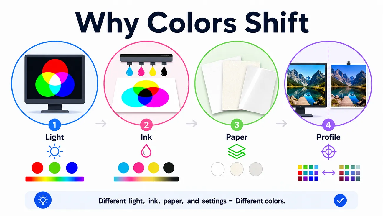
Key reasons for the difference between screen and print colors
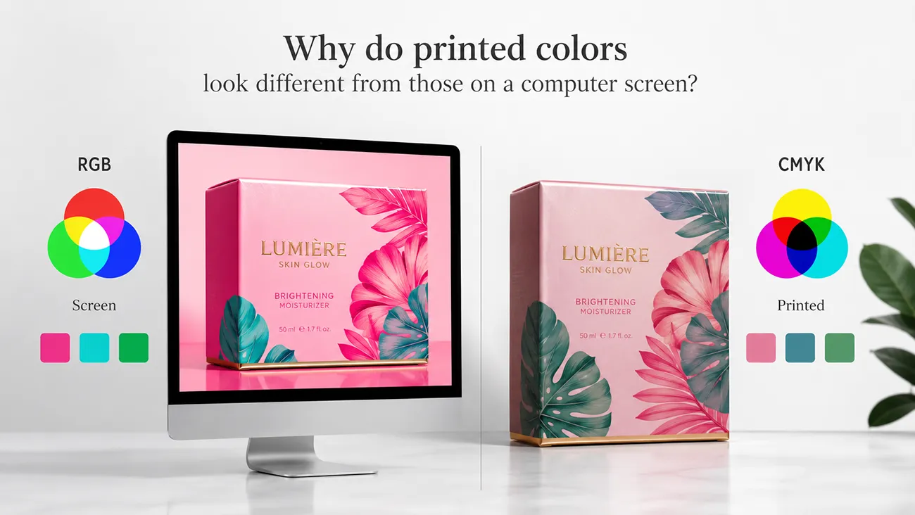
The fundamental cause lies in two completely different color display modes: screens use the RGB color mode, while printing uses the CMYK color mode.
1. Differences between RGB and CMYK color modes
Computer monitors, mobile device screens, and design software use the RGB (Red, Green, Blue) additive color mode. This mode supports ultra-bright, neon, and highly saturated colors with a wide color gamut. In contrast, physical paper packaging printing relies on the CMYK (Cyan, Magenta, Yellow, Black) subtractive color mixing mode. CMYK has a narrower color gamut and cannot reproduce certain vibrant RGB colors, resulting in natural color variations after printing.
2. Screen calibration and brightness discrepancies
Brightness, contrast, and color temperature vary across different laptops, monitors, and mobile devices, often without standardized calibration. A design that appears warm and bright on screen may look darker or more muted when printed on paper; additionally, ambient lighting conditions during viewing can affect how the human eye perceives color.
3. Impact of paper material and surface finishing
Paper texture, whiteness, and surface finishes significantly influence final color rendering. White coated paper yields brighter colors, whereas kraft paper and textured paper tend to produce darker, warmer tones. Processes such as lamination, hot stamping, and UV coating also alter the visual appearance of printed colors.
Real-world client case study:
A Canadian skincare brand once submitted a packaging design in RGB format featuring bright pastel tones for a custom gift box project. A client approved a file directly after viewing a digital proof, without performing a color check. Had mass production proceeded at that stage, the final printed colors would have appeared dull and lackluster compared to the on-screen display, resulting in a defective batch.
Our expert prepress team proactively converted the RGB files to standard CMYK mode, fine-tuned saturation and brightness to suit the selected matte paper stock, and provided physical color samples for the client's approval.
The final packaging perfectly reproduced the brand's intended color tones with zero deviation. This proactive color correction service saved the client from costly rework and ensured the product launched on schedule.
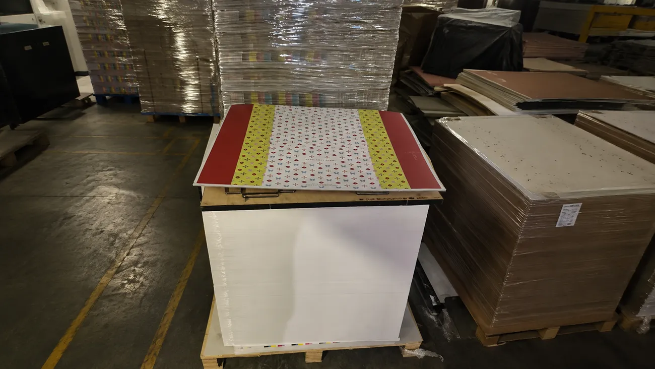
Why is Crown Win Packaging better at controlling color accuracy?
With 18 years of experience in paper packaging printing, we leverage standardized color management systems and mature production capabilities to resolve color discrepancies between screen designs and finished products for global clients:
Professional Prepress Color Correction: Our team automatically converts all RGB design files to CMYK, optimizes for color gamut loss, and adjusts tones based on paper material to faithfully reproduce the design.
Standardized Color Calibration: We use industry-calibrated monitors and professional color instruments to unify color standards and eliminate discrepancies caused by screen variations.
Free Physical Proofing: We provide physical color samples on the actual paper stock before mass production, allowing clients to verify the actual printed colors and preventing post-production disputes.
Extensive Material Matching Experience: We accurately predict color variations across coated paper, kraft paper, specialty paper, and various post-processing techniques, ensuring consistent color performance across batches.
Practical Tips to Avoid Color Discrepancies
When preparing packaging for print, always submit CMYK files; avoid using overly saturated RGB neon colors; verify colors using physical proofs rather than screen previews; and discuss paper material options with the manufacturer in advance. These simple steps can eliminate over 90% of printing color issues.
Conclusion
Color discrepancies between computer screens and physical printed packaging are normal due to the differences between color modes and the physical characteristics of printing. Crown Win Packaging offers professional file conversion, color correction, and physical proofing services to ensure you receive highly consistent, high-quality custom paper packaging that perfectly matches your brand's design vision. Contact us today for a custom packaging solution where print colors align precisely with your design files.
 How to Create High-End Packaging with a Minimalist Logo